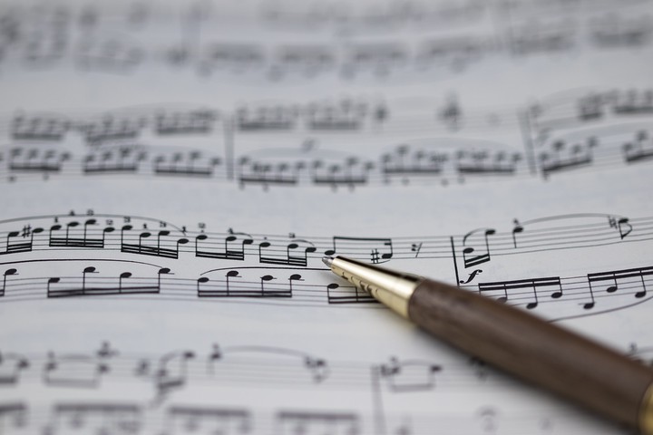
Data are the sheet music and data visualisation is the symphony
 Source: needpix.com
I’m definitely not the first (nor will I be the last) person to try and draw links between science and music but a recent(ish) tweet by Richard McElreath got me thinking on the idea a bit more.
Many performers of music cannot read it. Okay. There are other, often more intuitive, ways to learn music.
— Richard McElreath 🦔 (@rlmcelreath) July 18, 2020
Scientists perform stat models. Most scientists cannot read them. This is less OK, but there are other ways to learn models.
Short thread in which I strain this comparison pic.twitter.com/WP8m6554PQ
In this thread McElreath discusses the similarities between reading sheet music and mathematical notations - if you don’t know where to start it can all be pretty daunting and even if you do know where to start you don’t necessarily read it ‘word-for-word’. Now, as someone who dabbles in both sides of this argument I couldn’t agree more. Mathematical notation can be pretty scary, but if you look for patterns/elements that you recognise you can work out what the model is telling you and the same can be said when I’m looking at sheet music. The same goes with regards to the ‘degrees of separation’ and sheet music/models that are closer to my area of study/instrument of choice require less work to ‘decode’ than those that may be drastically different. McElreath goes on to discuss ‘maths anxiety’ and how that may be off-putting (or even scary for some) and actually decreases the liklihood of someone reading an article (Fawcett and Higginson, 2012). He also mentions maybe making mathematical notation more palatable - and here is where he caught my attention.
Hans Rosling has also made links to science and music:
“Most of us need to listen to the music to understand how beautiful it is. But often that’s how we present statistics: we just show the notes, we don’t play the music.”
and his argument is perhaps a bit more elegantly phrased and absolutely nails it if you ask me. If statistics (or equations and models) is the sheet music then we as the scientists or researchers are the conductors. It is the responsibility (and vision) of the conductor to translate what he sees on paper and make it art as well as something the general public can perceive and enjoy. The conductor does this by directing and ‘using’ the musicians to create the final product. The reason I use an orchestra here as opposed to a single musician here in my analogy is that I feel there are many ‘tools’ we can use to communicate the ‘scary maths’ and what we can learn from it, and much like how some scores play to the strengths of certain instruments so do some of the communication tools.
Having just said that I’m going to focus in on my all time favourite way of communicating science - visually! Hans Rosling is well known for his excellent visualisations - and data visualisation as a whole is on the rise (I regularly end up just oogling some of the beautiful infographics to be found on the web). A quick google search will yield multiple hits of different websites listing their top DataViz books - mostly focused on showcasing business data. Yet why have the sciences seemingly lagged behind - at least when it comes to journal articles? There are many beautiful examples of infographics that communicate results for popular science articles but journal articles tend to keep things very ‘vanilla’. With most (if not all) people accessing articles or resources online we are no longer restricted by printing or fitting figures and tables onto pages. We could potentially even embed links that lead to interactive dashboard-type applications (allowing people to play with a model y changing inputs/variables and see what it does and how various parameters are related) or even use animations. There are naturally some other concerns that need to be taken into account, such as accessibility and limited connectivity but as it stands there is no reason we cannot at least attempt to add richer visuals elements to our work. I think visual abstracts are a step in the right direction but what is to say we cannot extend this same ‘light hearted’ approach to the manuscript itself?
I’ve always joked that one day I will write a totally visual manuscript (Intro = digram/flowchart, Methods = schematic diagram, Results = plots and tables, and Discussion = diagram/flowchart) The thinking behind this is that I find it easier to articulate myself in a visual manner and almost all of my writing starts with me drawing a picture of what I plan on saying. This of course also means that I find it easier to visualise/draw what I am learning or reading as well - so it only stands to reason that the more visual elements a manuscript has the easier it is for me (and likely others) to get the bigger picture.
So I guess what this boils down to is me challenging us to think about how we can make beautiful music that can be appreciated by a broader audience and ask if we are getting the best out of our orchestra. Having a visual aid that is well designed can break down at least some of the language barriers and make out work easier to understand for a non-native speaker, we are ‘forced’ to cut out a lot of jargon which makes our work more interpretable across disciplines - or even less experienced individuals (I really don’t want to say non-scientists) or students and in a way we have to think harder about what our data are telling us, because if we don’t understand what is going it makes it very hard to translate that into a picture. Finally, to bring it back to the music analogy - much like how I would annotate my sheet music to make it easier to interpret we can also add other aids (annotations) along with our visualisations to help make the interpretation process easier - much like many infographics do.
This is me challenging us to play with our data a bit more and see what it wants to show us - and it doesn’t have to be fancy it can start with playing with colours and then the more comfortable you get the more you can stretch you boundaries. This is where projects like #TidyTuesday, #MakeoverMonday and the Story Telling with Data challenge are really fun - you can play with data in a ‘low pressure’ environment and get inspiration from others as to how they approached the same challenge and help you familiarize yourself with different plot types along with what works and what doesn’t. This helps you develop a library of sorts along with a bit of a personal style - much like how a conductor adds his own flair to sonata/concerto you can make your data visualisation your own! The next step of course (and this is me calling myself out) is taking the same playful approach when writing manuscripts for publication and instead of ‘throwing in’ a boxplot or two thinking of a better way that I can use that space (and time) to visually tell my story.
Have fun creating and pushing the envelope for data visualisation in science!
🐾 Tanya
Tanya Strydom
Postdoctoral Researcher
Self-diagnosed theoretical ecologist, code switcher (both spoken and programmatic), artistic alter-ego, and peruser of warm beverages.