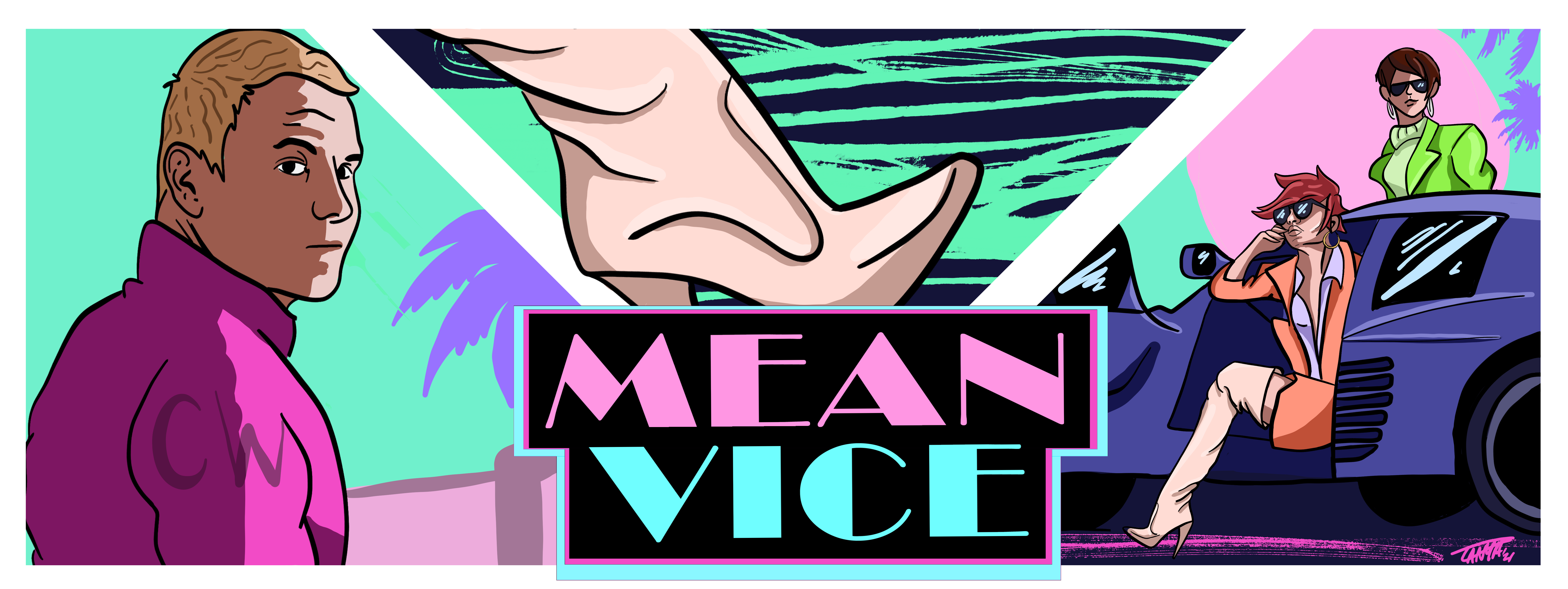
I take a great degree of pride in incorporating a strong visual element within the research I do. Be that through developing figures that provide a powerful visual narratives of concepts or trying to present data in ways that are both visually appealing as well as informative. I also like to spend time operating in the overlap of purely creative outputs and those that have ‘utilitarian’ scientific value - be that through the communication of research or playing with data-driven visuals.
Science through doodles
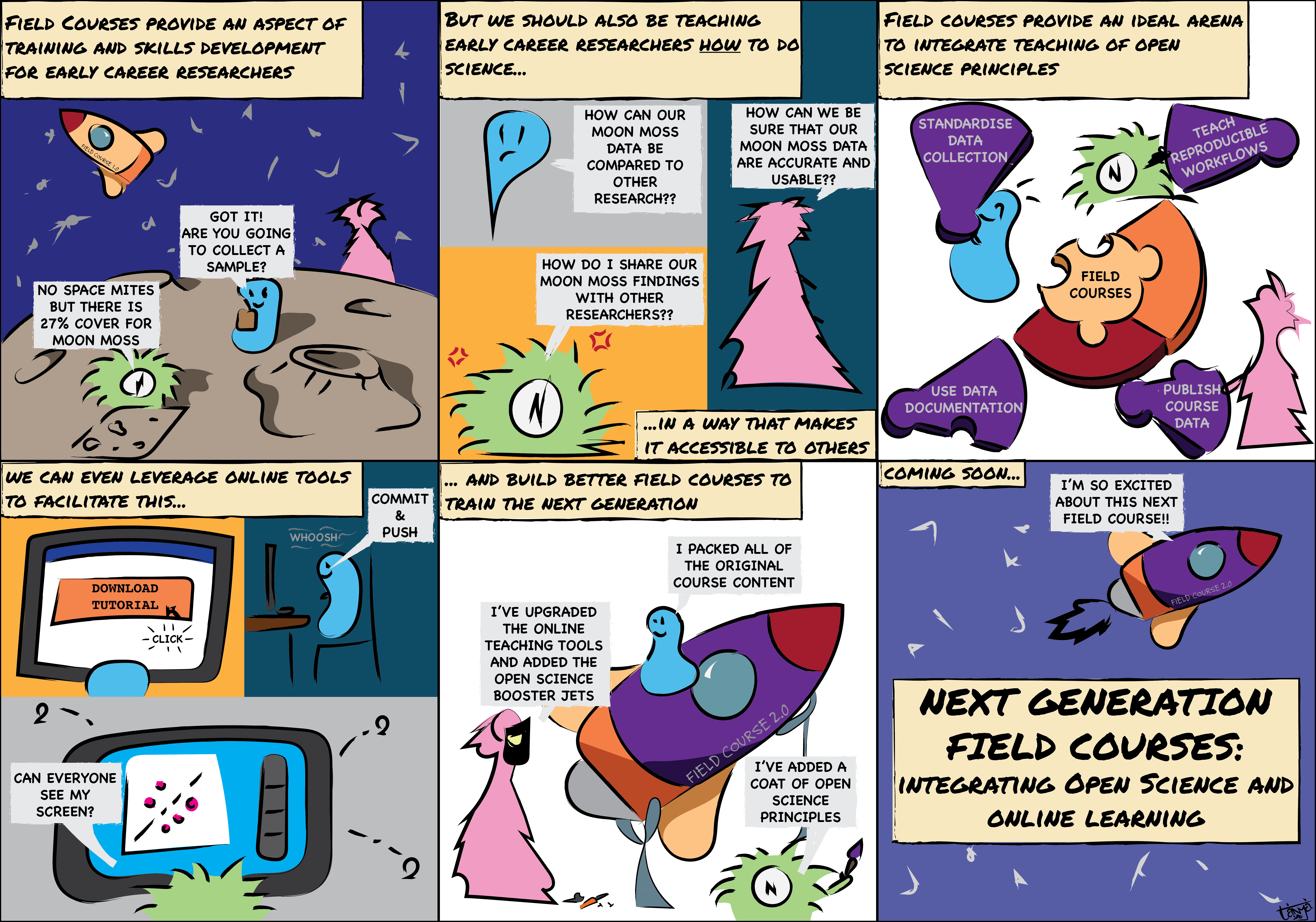
From 2020 - 2022 I had an awesome time creating a fortnightly comic strip for the Ecology for the Masses blog, where the goal was to inject a bit of humour while still communicating the central message of recent publications or ecology related news - creating some eLOLogy for the masses.
And every now and then I have been known to do some doodling of some of the research that I have been involved in, or been commandeered to help with creating visual assets for a project.
Seeing data
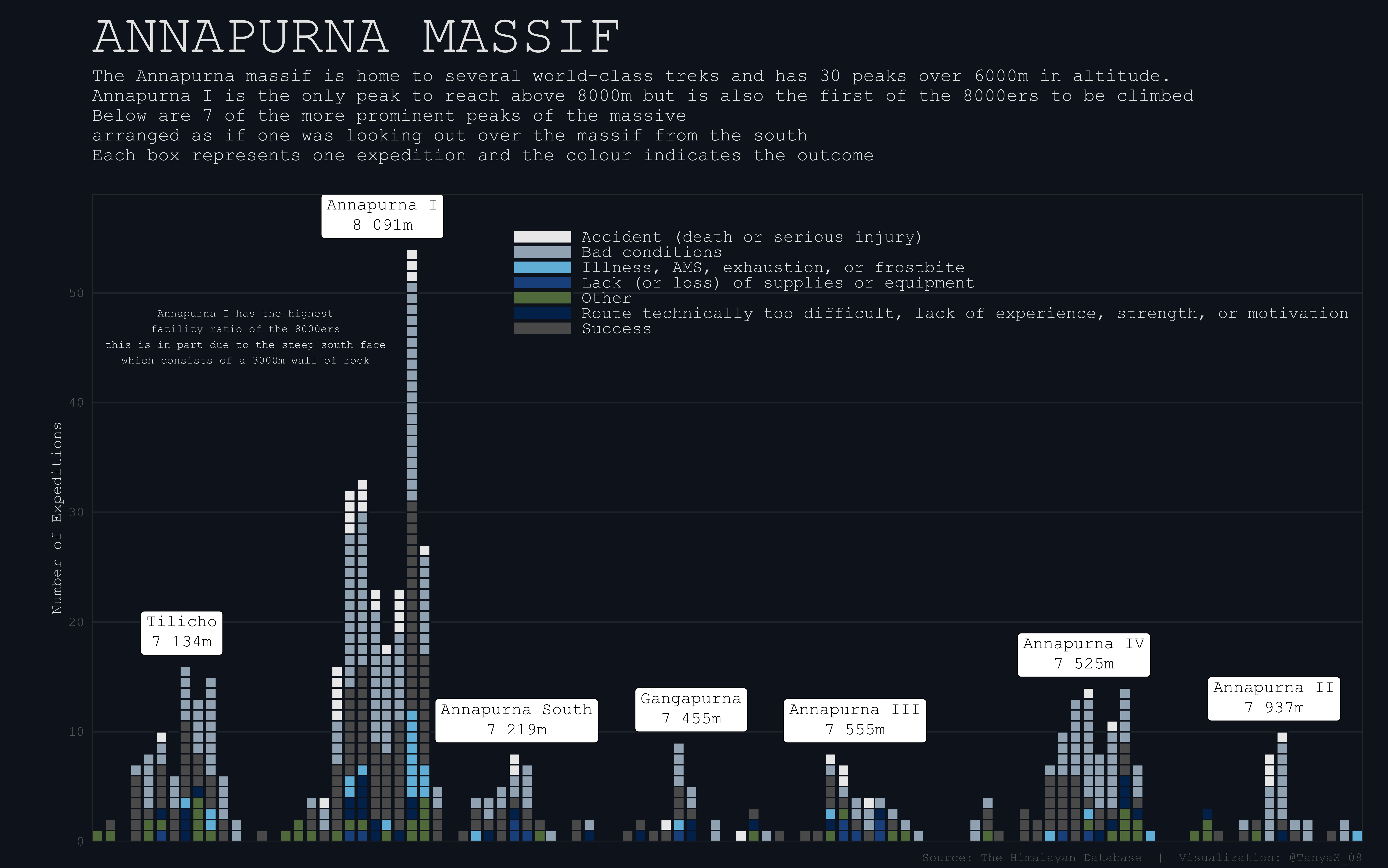
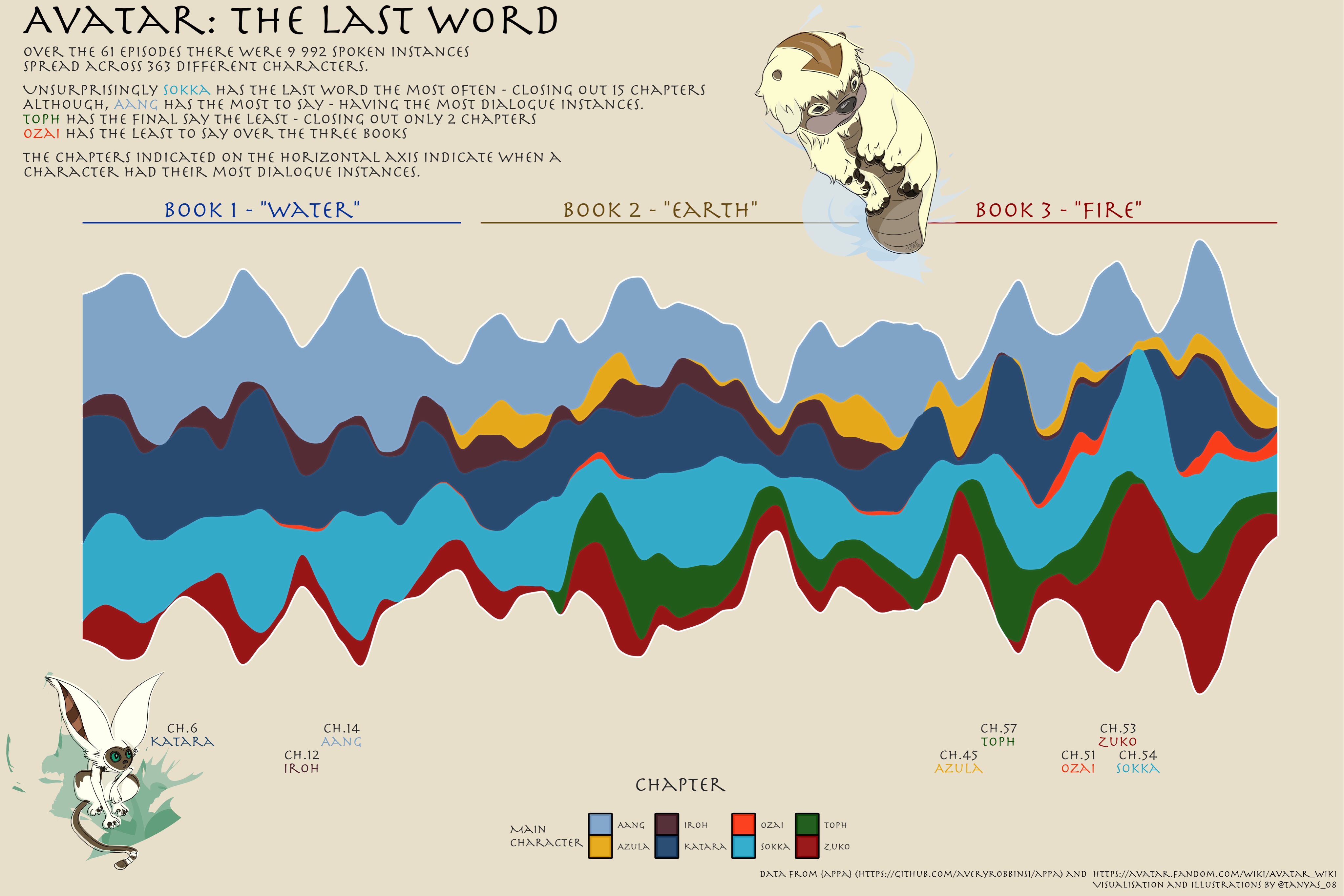
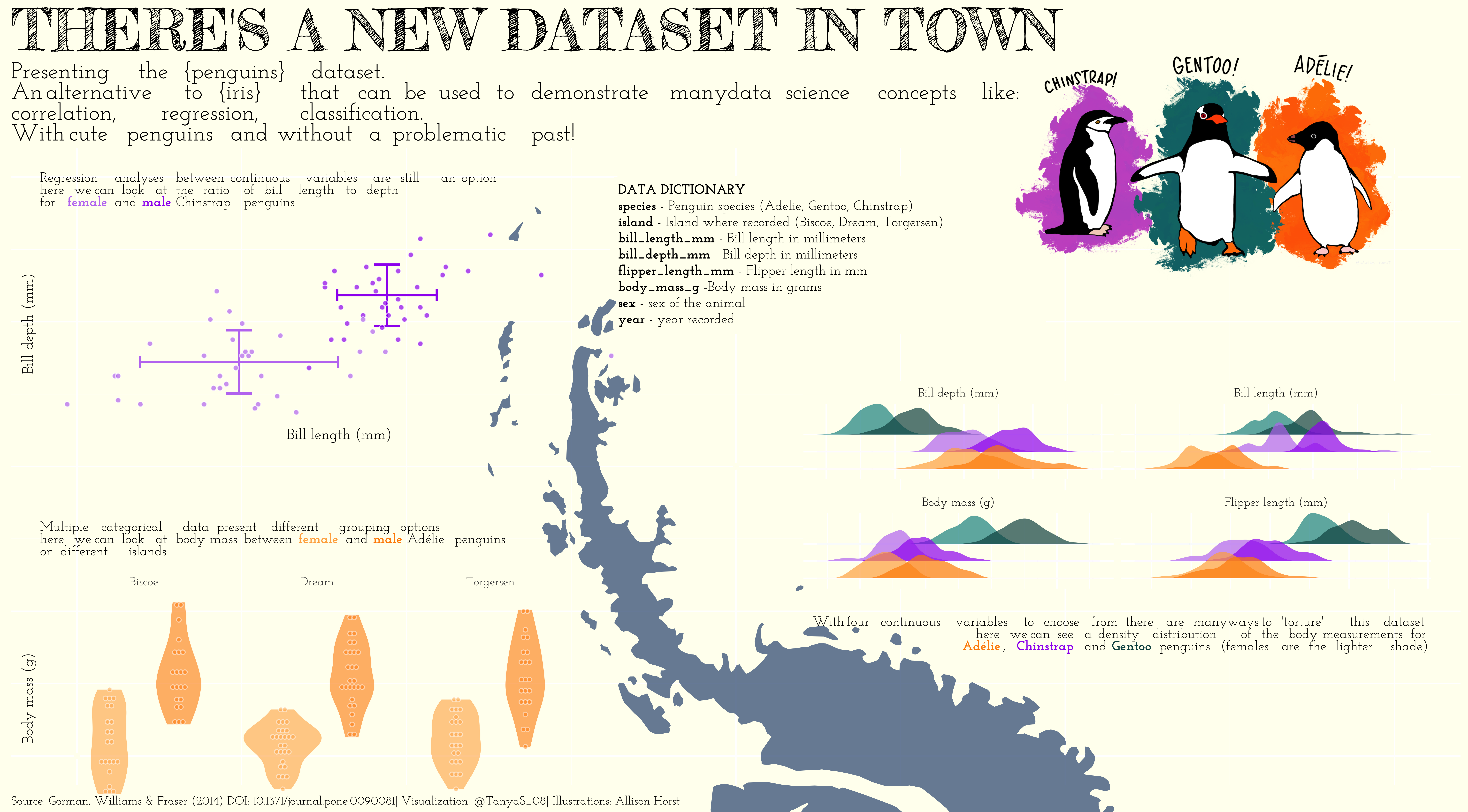
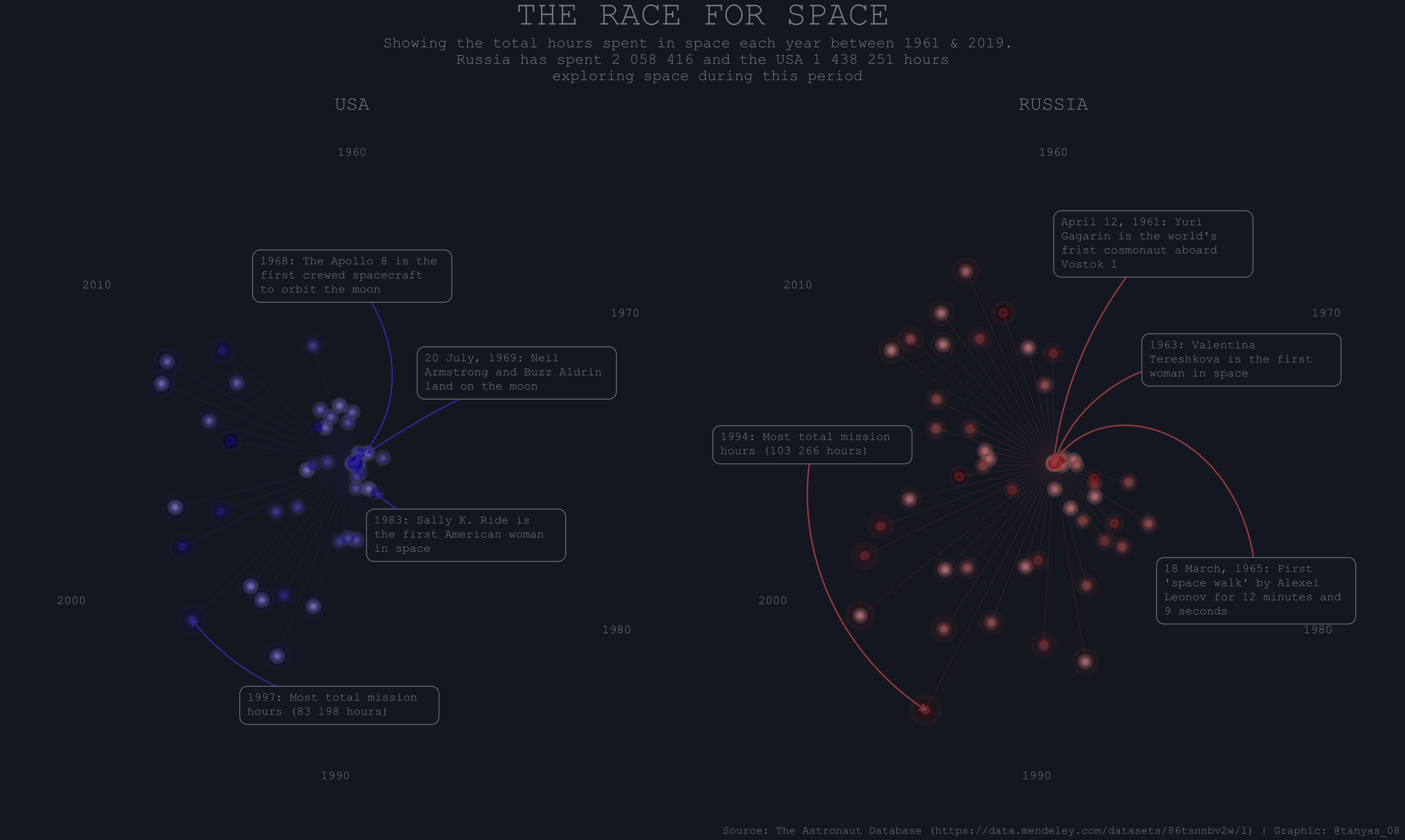
Of course as scientists we are often crunching numbers and looking at model outputs. However it is still important that we are able to visualise that data and I am a big fan of the work done by the TidyTuesday team when it comes to learning through experimentation. Although I don’t always have the time to participate every week I still find myself coming back to some of my previous plots and using those techniques in my actual research!


